New Layouts in Jitsi Meet
New layout for your 1:1s on meet.jit.si
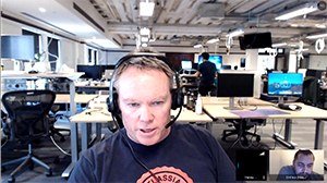
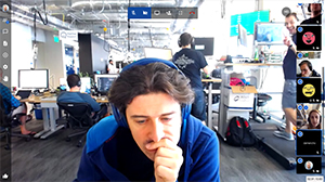
In the past people have often been confused about one specific aspect of our user interface:
Notice how in both of the above cases there is a black thumbnail representing the remote participant. When confronted to this concept many users found it unsettling and were often asking the same question:
Why is there a third person in my call ?!
Well, friends, we have heard you! In our new video version, this is changing completely. To begin with, your interface looks like this:
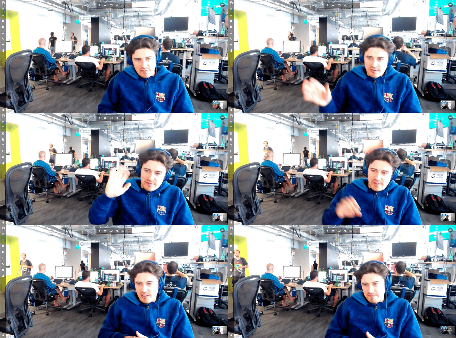
During your 1:1 calls, we are now only showing one thumbnail: your local camera view. The rest of the screen is free for your video feed. Also, in the case where you would like to check your local view a bit more clearly, you can still click and enlarge it. When you do that, we push the remote participant view to the top right corner like so:
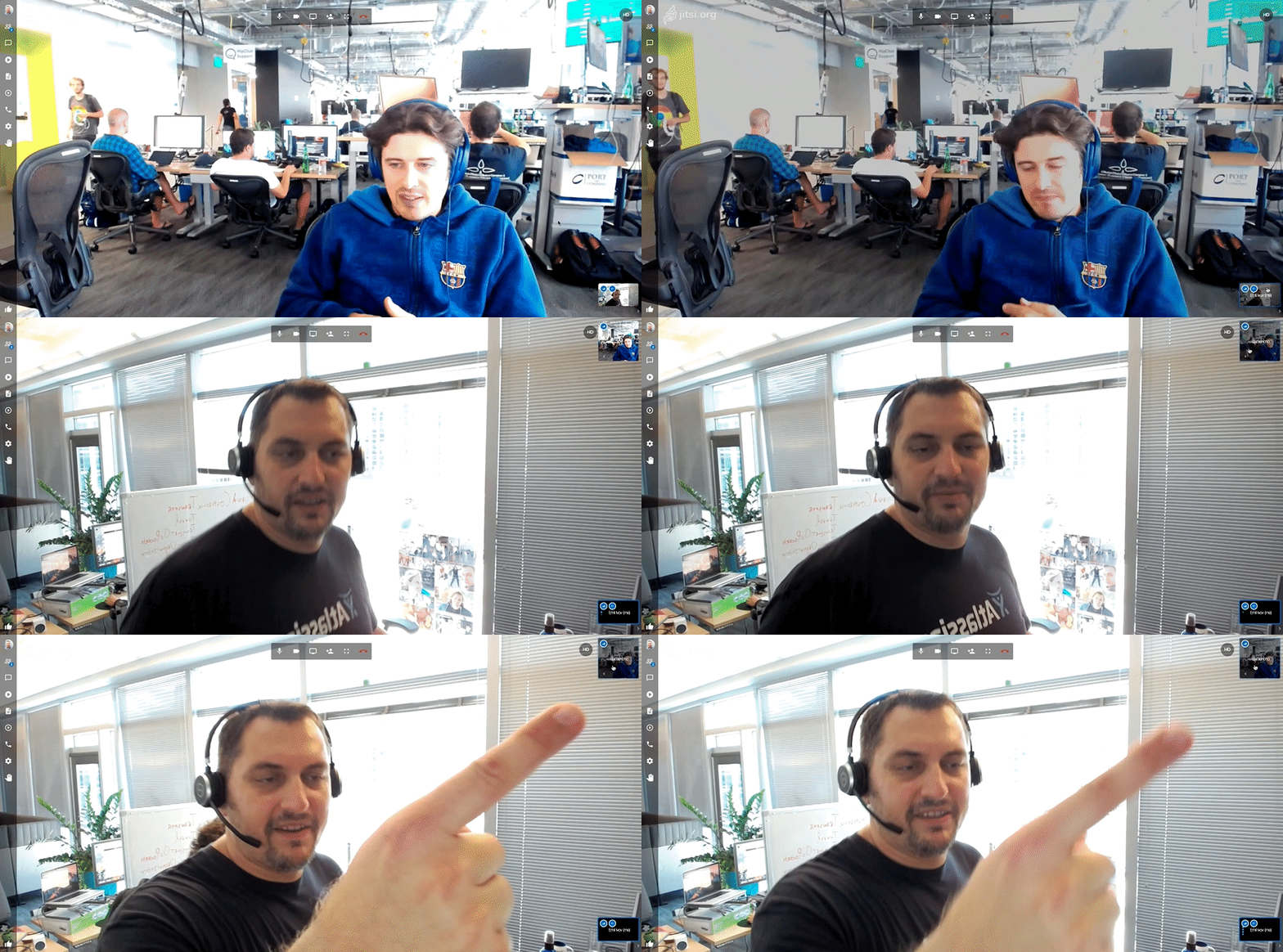
Click on that thumbnail and you are back to seeing a large view of your contact. Hope you like it!
New layout for your group calls too!
Once we were done with the above changes to 1:1, we took the opportunity to go and look more on how to improve other aspects of our UX and we focused on our group layout. So let’s look into that. Is there anything in the following images that bothers you?
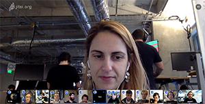
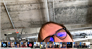
Chances are, you have probably experienced this yourself too! Modern computers come with a 16:9 screen. In other words, there’s plenty of width to go around but vertical real estate is often an issue, just as it is in the cases above where our filmstrip is fighting for space with the faces of your fellow conference participants.
Let’s take a step back and look into history. The reason today’s screens are that way is because this aspect ratio is good for watching movies. Well that’s all very nice but this isn’t really our use case here. In fact video conferencing is significantly closer to your typical news anchor use case, and you definitely don’t need that much width there. In fact, it is widely agreed that the best ratio for that is 4:3, which is what our first computers and TVs used to have.

